Gui.do
.webp)
Jansen
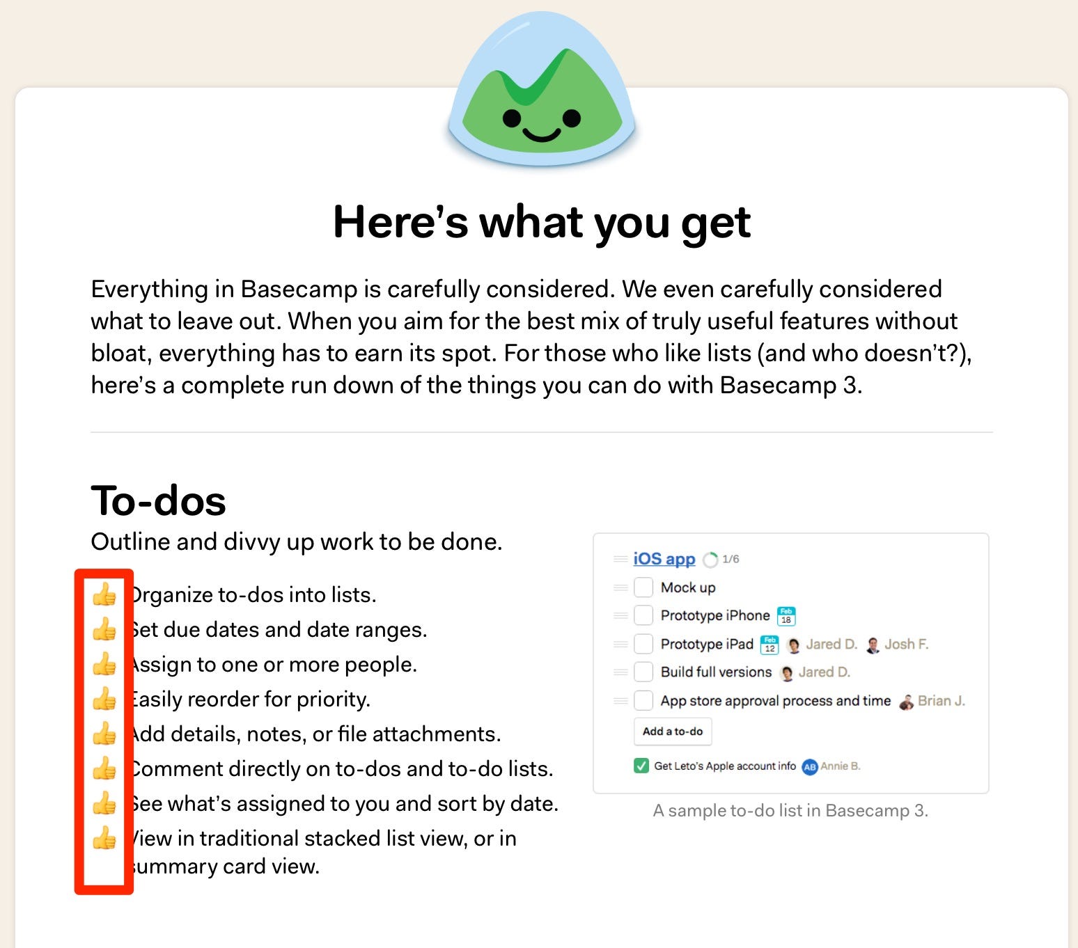
When creating an unordered list in a computer program, it usually looks something like this:
The dot could be replaced by ‘-’ but that’s usually where the variantions end.
To make it fit the designs better you’ll see different variations on websites, but simply “making it look better” is not always the (single) intention. We’ve done A/B tests that show that (green) ticks (compared to just a · or a - ) will actually increase the likelyhood of you buying whatever is being advertised. It’s actually one of the most consistent tests that will result in a small (but statistically significant) uplift.
The theory here is that we are trained to see ticks as ‘good’. Remember your homework and how your teacher marked it’s sections as being correct..?
The green doesn’t have a mayor effect, but it’s usually better than using a negative color like red (again from your homework).


Most of my content is published on LinkedIn, so make sure to follow me there!

Recently I've seen some (often absolute) statements going around, generally in the line of "open source commerce platforms are a terrible idea". Now of course different solutions always have different pros and cons.

A hierarchy of evidence (or levels of evidence) is a heuristic used to rank the relative strength of results obtained from scientific research. I've created a version of this chart/pyramid applied to CRO which you can see below. It contains the options we have as optimizers and tools and methods we often use to gather data.